Themes
The theme system allows complete visual customization of the application.
Built-in Themes
Theme Editor
In Settings → Theme:
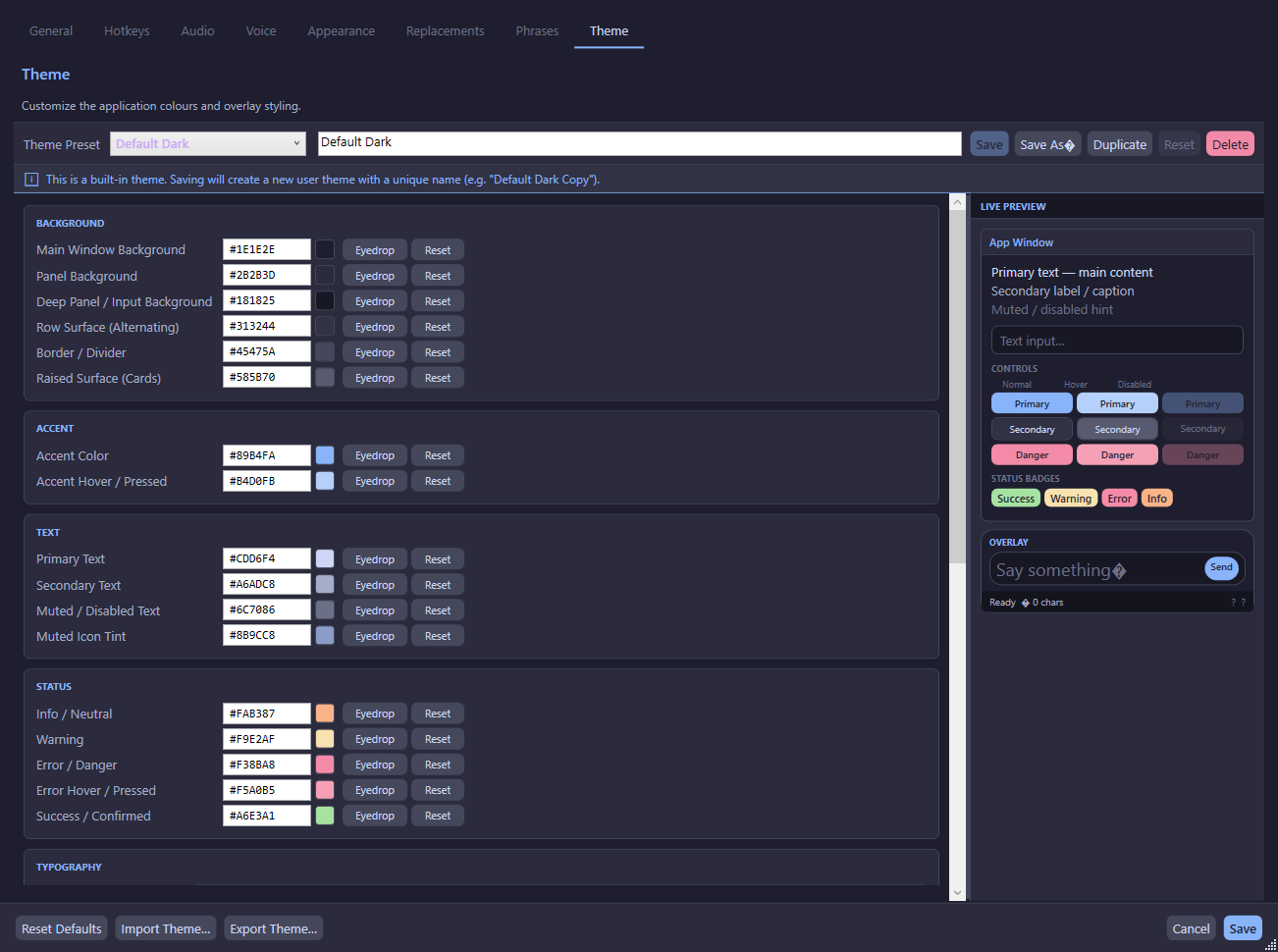
Colour Categories
Typography
Shape & Density
Colour Editing
Each colour swatch can be edited by:
- Clicking the swatch — Opens the Windows native colour picker dialog
- Clicking the eyedropper button — Opens a screen colour picker to sample any pixel on screen
- Typing a hex value — Directly enter
#RRGGBBvalues
WCAG 2.1 AA Contrast Checker
The theme editor includes a built-in contrast checker that evaluates colour pairs against WCAG 2.1 AA standards:
The contrast ratio is calculated using the relative luminance formula from the WCAG 2.1 specification.
Theme Management
Preset Selection
Select any theme from the dropdown to load it into the editor. Changes are previewed live.
Save As / Duplicate
- Save As — Save the current theme as a new user theme
- Duplicate — Create a copy of the current theme and switch to it immediately
Delete
User-created themes can be deleted (with confirmation). Built-in themes cannot be deleted.
Import / Export
- Export — Save a theme as a
.ttsthemeJSON file - Import — Load a theme from a
.ttsthemefile (validates required fields)
Reset to Default
Right-click the tray icon → Reset Theme to Default to immediately revert to the Default Dark theme.
User Theme Storage
User themes are stored as individual .ttstheme JSON files:
%AppData%\TtsCommunicationTool\themes\*.ttsthemeBuilt-in themes are defined in code (ThemeDefaults class) and always appear before user themes in the preset list.
Theme Application
Themes are applied via IThemeService.Apply() which:
- Maps each
ThemeSettingsproperty to a WPFDynamicResourcekey - Creates
SolidColorBrushobjects from hex colour strings - Sets each brush as
Application.Current.Resources[resourceKey] - All XAML elements using
{DynamicResource ...}update automatically